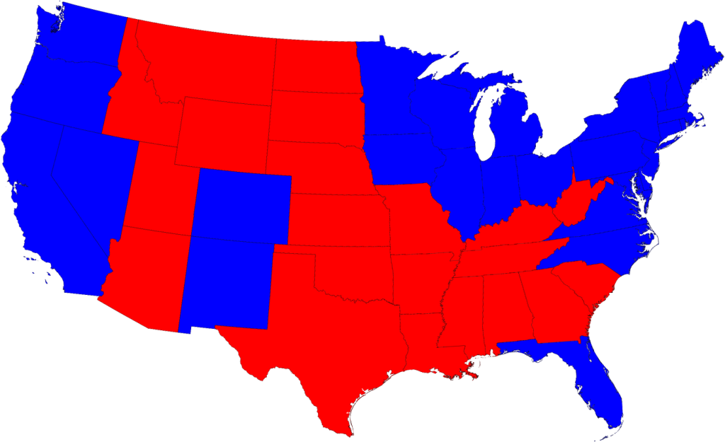
The thing is, and it doesn't take a rocket surgeon to know this, that this is the grossest generalization of the political landscape. It actually looks like this:
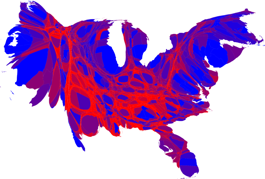
No, it's not how Pangea would have voted in the 08 election. This is a University of Michigan cartogram, a thematic map where a variable (i.e. population) is substituted for land area (according to Wikipedia). In this case, counties are colored either red, blue or some shade of purple according to 2008 election returns, and then a cartogram is generated using population as the variable impacting land area.
You can read through the process here. See those mushed-up red areas? That's the "white, rural, regional" Republican part of the country - actually most of the landmass.
Clear as mud? Thought so. Look at California on the squishy map. Now look at the two HUGE areas of California - the Bay Area and LA. Both >70% Democrat. Same for New York City on the east coast. They pretty much determine where their respective states (and a lot of electoral votes) go. It's actually pretty easy if you read through the page, and it makes sense to my brain. I'd love to see it on an election night, though. I can see Wolf Blitzer now, "And this just in, CNN is calling Wyoming for - hey, where the f**k is Wyoming?"